Same sound, same vibration, but a completely different feeling every time: joy when a transfer lands, anxiety over an unexpected charge, pride when you hit a savings goal.
That emotional range coming from what's technically the same alert isn't a coincidence.
It's the result of an entire design discipline the fintech industry calls "Dopamine Banking."
In this article, we break down the elements behind the emotional design of payment notifications: color, sound, wording, and tiny visual movements, and explain how they work together to engineer a very specific feeling, often without you noticing it at all.
Quick Summary (TL;DR)
The emotional design of payment notifications in fintech apps relies on careful study to trigger specific emotions, not just deliver information.
Designers use color deliberately: green for safety and success, blue for trust and calm, red for alerts or urgency, alongside short, cheerful sounds that trigger a dopamine response in your brain the instant you hear them, before you've read a single word of the message.
Even sentence wording is carefully considered: there's a huge difference between a cold, alarming "Your card was declined" and the more empathetic "We couldn't complete your payment, here's how to fix it quickly."
This approach, adopted by companies like Revolut, Monzo, and N26, aims to build emotional loyalty and enhance the user experience.
But it also raises a legitimate question about the fine line between a comfortable design and a design that nudges you into spending more than you planned.
Why does color carry so much weight in payment notifications?
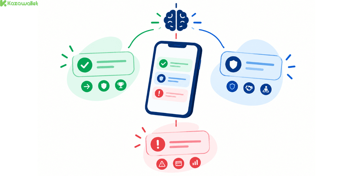
Before you read a single word of a notification, your brain has already started forming its first impression from color alone.
That's not random; color is one of the fastest triggers that reaches the brain and shapes a feeling, faster even than processing the words themselves.
- Green dominates nearly every payment app worldwide because it's mentally linked to meanings like "go," "safe," and "success," and it's typically used to confirm a received payment or a successfully completed transaction.
- Blue, the most common color in traditional banking interfaces, conveys a sense of stability, trust, and calm, which explains why most major financial institutions adopt it as the core color of their visual identity.
- Red, by contrast, gets used more cautiously, since it's associated with urgency or danger, so it tends to appear for fee alerts or warnings about exceeding a spending limit.
This deliberate use of color isn't just visual decoration; it's a tool used intentionally to either reduce the anxiety that comes with handling money, or to amplify it when your immediate attention is needed.
Why does the notification sound itself create a feeling before you even read the message?
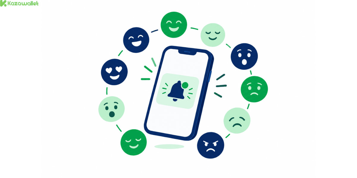
This is one of the more surprising facts in this field: the neural response you feel when you receive a notification isn't tied to the content of the message; it's tied to the exact moment you hear the sound or feel the vibration.
Research in behavioral psychology points to this moment triggering a fast dopamine response in the brain the instant the alert tone plays, before you've even glanced at the content, in a way that closely resembles classic Pavlovian conditioning:
With repetition, your brain links the sound itself to an expectation of a reward or important information, regardless of what the content actually turns out to be.
This partly explains why fintech companies choose short, cheerful, distinctive sounds instead of dry default operating-system tones, aiming to build a positive, repeatable mental association with the app itself, much like the familiar beep you hear when a tap-to-pay transaction succeeds.
Read more about The Invisible Milliseconds: What Really Happens When You Tap to Pay.
How does the wording itself change how you feel about the exact same financial event?
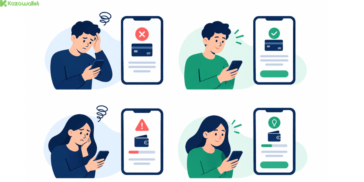
The exact same financial event - your card getting declined at checkout, for example - can be framed in two fundamentally different ways, with very different emotional impact:
- The traditional, cold phrasing: "Your card was declined." It's short, cold, and it leaves the user anxious with no practical guidance on what to do next.
- Modern, empathetic phrasing: "We couldn't complete your payment; here's how to fix it quickly." The exact same information, but delivered in a tone closer to a helpful friend, with immediate direction toward a solution instead of leaving the problem hanging.
This same pattern shows up in other similar contexts too:
Instead of an alarming "Your balance has exceeded its limit," some modern apps lean toward something closer to "Your balance is running low, want help with a budget plan?", a complete reframing of the exact same issue from an accusatory tone to a supportive one that offers a solution instead of just a warning.
What's the story behind "Dopamine Banking," the trend that has taken over the fintech industry?
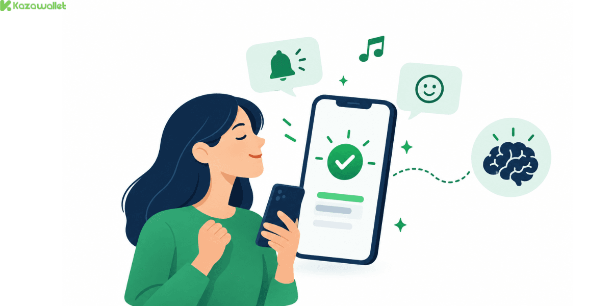
UX designers in the fintech sector describe this comprehensive approach as "Dopamine Banking," the deliberate use of design elements, from small visual animations after a successful transaction to distinctive sounds to friendly confirmation messages, all aimed at creating repeated moments of satisfaction that reinforce a user's sense of trust and accomplishment toward their financial app.
Companies like Revolut use smooth, subtle motion after every completed payment, while Monzo has built part of its user loyalty around simple confirmation messages like "Payment received safely," which, through repetition, turn into a kind of habitual mental reward.
Dopamine banking in payment notifications is also linked to what behavioral science calls "Nudge Theory," where personalized notifications aren't just used to confirm transactions, but to gently steer users toward better financial decisions, like reminding them to save or flagging a recurring spending pattern.
Is the Emotional Design of Payment Notifications Always Helpful, or Can It Be Exploited?
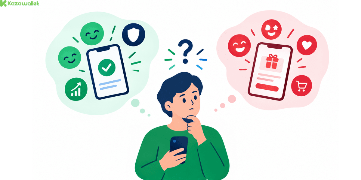
It's worth pausing on, with a balanced view. Thoughtful emotional design can genuinely serve your interests, by reducing your anxiety around handling money and simplifying your understanding of your own financial situation.
But the exact same psychological tools used to reassure you - small repeated mental rewards and continuous engagement loops- are precisely the tools that can be used to encourage you to spend more than you planned, or to interact with the app more often than serves your real financial interest.
The difference between the two uses comes down to the intent behind the design: is the goal genuinely improving your financial wellbeing, or simply increasing your engagement with the app at any cost?
As an everyday user, it's genuinely hard to tell the two apart easily, and that's exactly why simply being aware that this emotional design exists at all is an important first step in protecting yourself.
Frequently Asked Questions
Is emotional design of payment notifications necessarily a bad thing?
No, not necessarily. It can genuinely serve your interests by reducing anxiety and simplifying your understanding of your financial situation, but the same tools can also be used to encourage more spending or engagement than you need.
Why do most payment apps specifically use the color green?
Because green is mentally associated with safety, success, and "go," making it a popular choice for confirming successful transactions and reducing the anxiety that comes with them.
Why do I react to a notification sound before I've even read its content?
Because the fast neural response, specifically a dopamine release, is tied to the moment you hear the sound itself, not the content of the message, in a way similar to repeated conditioning.
In closing
The notification you receive with every payment isn't just a neutral technical message; it's the product of carefully engineered emotional design, using color, sound, wording, and motion to shape how you feel about every financial transaction you make.
This design isn't inherently bad, but it deserves your awareness, so you can tell the difference between genuine peace of mind built on real clarity and attractive design that's simply meant to keep you engaged with the app longer than you actually need to be.